Accordion
Accordions are panels that can be expanded or collapsed to help reduce the amount of information presented to users. Its duty is to maintain the focus of a user's attention by reducing clutter, confusion and cognitive workload.

Brief
Audit existing accordion implementations. Document variations. Analyze feedback. Define guidelines. Create prototypes. Develop standardized code. Ensure modularity. Implement accessibility. Iterate based on feedback. Document guidelines. Communicate changes. Monitor adoption.
Roles
UI Designer
UX Designer
Design Sytem
Client
Service NSW
Timeline
Mid 2021
What is Accordion?
Accordions are panels that can be expanded or collapsed to help reduce the amount of information presented to users. Its duty is to maintain the focus of a user's attention by reducing clutter, confusion and cognitive workload.
Looking in
Looking out
Accordions Are Not Always the Answer for Complex Content
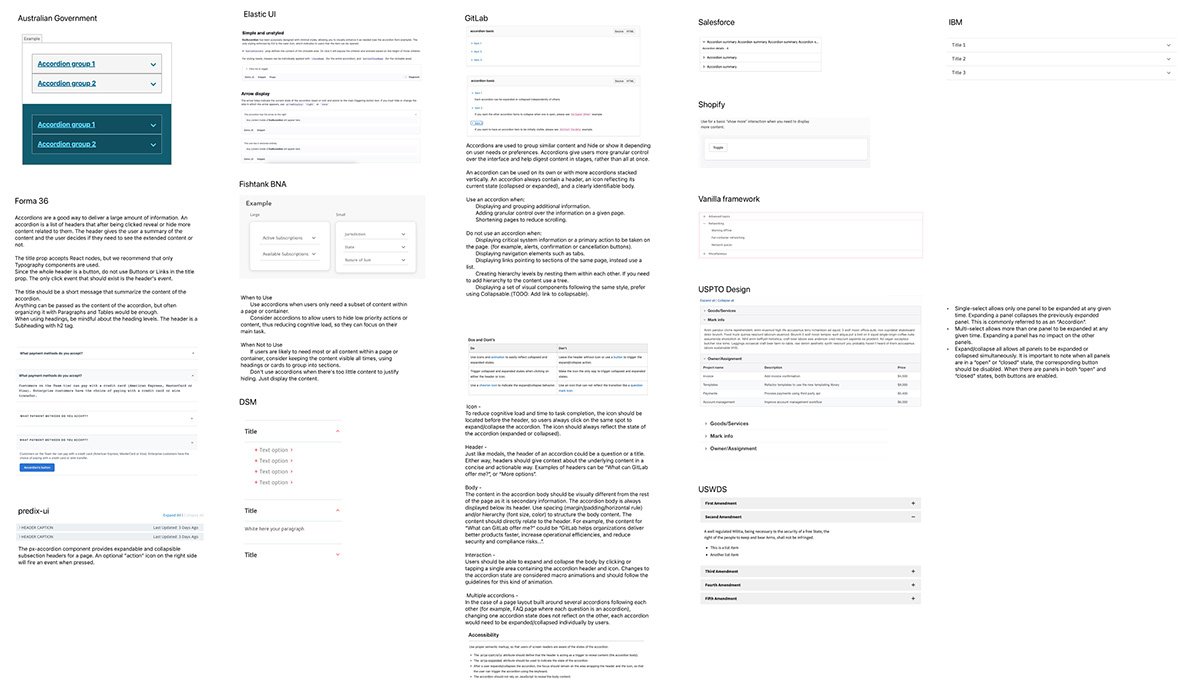
Accordions are a good way to deliver a large amount of information which can be broken down to help users prioritise and digest content in stages, rather than all at once. It also gives users the ability to hide irrelevant content and keep them focus on what they want to read.
Accordions should be avoided when users need most or all of the content on the page to answer their questions. As accordions shorten pages and reduce scrolling, they also increase the interaction cost by requiring people to decide on topic headings. Other consideration when using accordions:
Printing
Complex content (e.g. forms, widget) - accessibility risk & diminish users’ awareness
Do’s
When users only need a subset of content within a page or container.
To allow users to hide low priority actions or content, thus reducing cognitive load, so they can focus on their main task.
When displaying and grouping additional information.
To add granular control over the information on a given page.
For simple and less complex content
Don’ts
When displaying critical system information or a primary action to be taken on the page. (for example, alerts, confirmation or cancellation buttons).
If users are likely to need most or all content within a page or container, consider keeping the content visible all times, using headings or cards to group into sections instead.
When there's too little content to justify hiding.
When there’s links pointing/jumping to sections of the same page.
Create hierarchy levels by nesting them within each other.
When the page is most likely to be printed


